
Stop SEO Cannibalization: How to Hide Mobile Content in Divi Without Losing Rankings
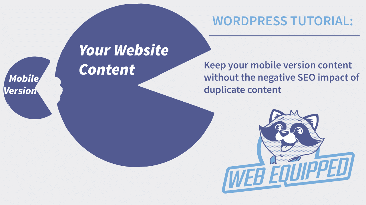
Duplicate content is one of the sneakiest killers of strong SEO. While Google is smart enough not to penalize you for mobile vs. desktop layouts most of the time, having two identical blocks of text on the same page (one hidden for desktop, one visible for mobile) creates confusion.
It dilutes your keyword relevance and, worse, allows Google to pull the wrong text snippet for search results.
If you use the Divi Theme by Elegant Themes, you know how easy it is to create mobile-specific sections. But if you aren’t hiding those sections properly, you are leaving SEO equity on the table.
Here is the technical, search-engine-optimized way to hide mobile content in Divi using aria-hidden="true" and data-nosnippet.
The Problem: Mobile Visibility vs. SEO Reality
In Divi, we often duplicate a section, hide one on desktop, and hide the other on mobile. Visually, this works perfectly. However, in the HTML source code, both sections still exist.
To Googlebot, this looks like you have two paragraphs saying the exact same thing. This forces Google to choose which version to index or use in the snippet, often resulting in a poor user signal (a “click” vs. a “bounce”).
To fix this, we need to tell Google: “Ignore this block for search ranking and snippets.”
The Solution: The data-nosnippet & aria-hidden Combo
We will target the specific Divi Section containing your duplicate mobile content. We cannot use the standard Divi builder attributes field for this (as it doesn’t exist). Instead, we will use a Code Module workaround.
Step-by-Step Implementation Guide
Step 1: Identify the Duplicate Section
Open your page in the Divi Visual Builder. Locate the blue/grey section bar that holds the content intended only for mobile users.
Step 2: Insert a Code Module
Inside that specific mobile section, add a new Code Module. Place it at the very top of the section (before any text or images).
Step 3: Inject the SEO Directives
Open the Code Module settings and paste the following raw HTML/JavaScript snippet into the Code text box:
<script>
(function(){
  // Find the parent Section wrapper of this code module
  var parent_section = document.currentScript.closest('.et_pb_section');
  if(parent_section){
    // Tells screen readers and Google's parser to ignore this as primary content
    parent_section.setAttribute('aria-hidden', 'true');
    // Explicitly tells Google not to use this text for the search snippet
    parent_section.setAttribute('data-nosnippet', '');
  }
})();
</script>
Step 4: Save & Update
Save the Code Module settings. Then, save the page (the purple button in the bottom right corner).
Why This Works for SEO
This method is superior to simply using Divi’s built-in “Hide on Desktop” toggle. Here is what happens now:
data-nosnippet (Google Specific): When Googlebot crawls your page, it reads this attribute. It tells the search engine: “You can still read this text to understand the page, but do not use this text in the blue search result snippet.” This stops Google from showing your mobile-optimized short text over your desktop-optimized long text.
aria-hidden="true" (Accessibility & Semantics): This flags the content as presentational. It helps search engines understand that this content is a duplicate layout helper, not unique informational content, reducing the risk of “soft 404” or duplicate content filters.
Verifying Your Fix
After publishing, you must check if it worked.
Open your live website.
Right-click and select View Page Source (Ctrl+U or Cmd+U).
Search for data-nosnippet.
If you see the mobile section wrapper looking like this, you are good to go:<div class="et_pb_section ..." aria-hidden="true" data-nosnippet>
The “No-JavaScript” Fallback (CSS Only)
If you prefer to avoid JavaScript, you can add a pure CSS solution via Divi -> Theme Options -> Custom CSS. This is weaker for SEO (it doesn’t use data-nosnippet), but it helps with rendering:
/* Hide mobile duplicate content from Google's layout shift scoring */
.mobile-duplicate-section {
  content-visibility: hidden;
  height: 0;
  overflow: hidden;
}

@media only screen and (max-width: 980px) {
  .mobile-duplicate-section {
    content-visibility: visible;
    height: auto;
    overflow: visible;
  }
}
Note: You would need to assign the CSS class mobile-duplicate-section to your section in Divi’s Advanced tab for this to work.
Final Takeaway
Do not rely on Divi’s visual builder alone to solve SEO problems. While Divi is great for design, search engines see the raw code. By adding the data-nosnippet attribute via the Code Module method above, you ensure your desktop content remains the primary authority, your mobile users still see the layout they need, and your SEO rankings stay secure.
Need more Divi SEO tips? Check your Core Web Vitals after implementing this—you will likely see a boost in your “Cumulative Layout Shift” (CLS) score as well.